Showing posts with label process. Show all posts

Monday, September 9, 2013

Big batch of September sketches


As you can see, I was in a rather pensive mode in the middle of last week.


On Sunday, I did a bunch of quick sketches of people in church in my little Moleskine again.  It's a lot easier to draw the folks sitting in the pews than it is to draw the musicians and the pastors, who keep moving on me.  


When I'm out of the house, I'm usually drawing with a ballpoint pen.  At home, I tend to use pencil, at least for preliminary sketching.  I think I'll try practicing more with using the pen at the outset.  See if I can develop a more confident ink line.

Now I need to go do my sketch for today.  I'll post it with my next batch.


Tuesday, June 18, 2013

Our Dad's Watches and Father's Day Memories


A few months ago I received a request from a new business to do a very specific illustration: a boy seated on his dad's lap and hearing the ticking of a watch for the first time.  I suppose I might have turned down a commission to do something that had to match a client's mental image so exactly, but this challenge resonated well with the general direction of my illustration work.  I took the project on, and I'm very happy that I did.

Business owner August Monteleone wrote a very nice blog post about the illustration and the story behind the image he commissioned.  You can read it here: http://dadswatch.blogspot.com/2013/06/fantastic-new-logo-and-other-happenings.html. Augie was a pleasure to work for. I got a strong sense of this being a man who cares deeply about what he does. (I expect that if you have a classic watch in need of restoration, or are interested in purchasing a timepiece as a gift for someone special, Our Dads Watches would serve you extremely well.)

I knew I needed to take special care as I was illustrating a memory for a man with great love for his father. I was surprised at how meaningful the work became for me too. I  used a batch of photos from a Google image search for sketching practice and working out the posing of the figures.  But then I needed to better visual references to nail the details of the watch and the shoes at specific angles.  I used the actual 3-D objects: my own dad's watch and shoes.  I drew the preliminary sketches in pencil, emailing scans to the client for feedback. I then revised the pencil sketches and emailed scans for approval. I finished the inking and coloring of the approved composition in Corel Painter 12.  As I worked, I felt a rush of warm memories of early years with my father and the little life lessons that slipped out in relaxed moments in the living room after he returned from work. 

Last Sunday, Father's Day, months after completing the Our Dads Watches project, my mind drifted back to working on this illustration and the warm feelings it engendered.  


Thank you so much, Augie!

Saturday, May 25, 2013

Illustration Friday: Tension


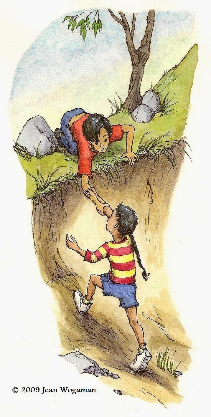
This week's Illustration Friday sketch is a remake of a remake of a remake of a remake of an early portfolio piece I called "Helping Hand."

Here's the first one (in watercolor on Arches hot press paper):


With a couple of portfolio critiques by children's book publishing professionals, I learned that the characters in my original picture were generic and their expressions bland enough to undermine my quest for employment as an illustrator.  A year or two later I took a stab at making them more dynamic.


One redo effort (with Copic Multiliner SP pens on Dick Blick 80 lb. drawing paper) had the girl about to crash headfirst into the creek bank. 

The next was closer to the original but, like the remake above, with the girl's head twisted back as if looking at someone or something she's trying to get away from in a hurry:


For this week's IF topic, I decided to take the last remake sketch and use it as a template for an ink layer in Painter 12, altering lines and details to increase the TENSION.  To save your scrolling muscles, here is the most recent drawing again:


Perhaps I'll attempt another full color version if I have time later.


How about you?  Do you ever go back to work you did months or years earlier and recraft it using new tools and your increased knowledge?

Wednesday, April 17, 2013

Illustration Friday: Wild


For this week's Illustration Friday, I toyed with a new working method in Corel Painter 12.

The black line you see is made with the crowquil brush tool, varying the size between 2 and about 5 pt.  I drew that first and made it the top layer in the file.  The color wash is made with a variety of gouache brushes.  This time I used only one wash color.  The different tonal gradations come from painting on separate layers and adjusting the opacity of each layer.  I like the simplicity of this method and the feel of the brushes involved. But as I add more layers, my old PC gets painfully slow.  Still, I think it's a process worth tinkering with for a while.  Maybe, one of these days, I'll get a new powerhouse machine.

The characters in this scene are loosely based on characters in a middle grade novel currently out on submission to agents.  I manufactured this scene purely for the IF challenge.  Nothing like it happens in the actual story, although I did find that knowing the characters ahead of time helped me to generate the scene more easily.

Tuesday, March 5, 2013

Checking in

Sorry for all the blog silence of late.  I have been hard at work on a commercial project and finishing up revisions on a novel, trying to get it all done before my daughter comes home for her last college spring break. (Oh, my God! I can't believe she's graduating in May!)

Since I don't really have time right now for a proper blog post, I'll share a link to one on the process of illustrating and designing a book cover by Irene Gallo at Tor books.  Tor commissions some of the best artwork in the publishing industry, definitely worth a look-see, and a good read for illustrators and authors interested in learning more about the kind of thinking going on behind cover design.

Saturday, February 2, 2013

Bottles

Potion bottles done in Painter. Simple and quick. The subject matter is inspired by a scene from Harry Potter and the Sorcerer's Stone. First I did a pencil sketch on paper and scanned it. Opened the scan in Painter and saved it as a RIFF. With basic paper as my canvas texture I lifted the sketch to a watercolor layer. Then I created an ink layer above that. I started drawing with the real drippy pen brush, but then switched to the crowquil.  It just seemed to work better with the scale and detail of this particular drawing.  For the flat color, I created a layer just above the canvas and painted with wet gouache round brush.

Monday, January 28, 2013

Illustration Friday: Wings


For this week's Illustration Friday challenge, and for our (fingers crossed) next Super Bowl champions, I give you Ravens in Flight.

I drew this with the real drippy pen brush in Painter. I love the real drippy pen!  It feels so natural.  It's much more responsive to pressure and stroke speed than the crowquil or bamboo pen brushes.  Expect to see more real drippy pen images here.

I added two layers of Painter's real watercolor.  I know I said I didn't think I'd use it again because it's painfully slow, but I could not resist.  I am a watercolorist at heart.  The second layer was a killer.  It took my poor little PC ages to process my brushstrokes.  I may have to plan compositions that require only one layer of real watercolor.

Thursday, January 24, 2013

My Favorite Things


Inspired by Abigail Halpin, I have decided to follow John Hendrix's advice to find my artistic voice.  Please visit his blog to read his five recommendations.  It will be worth your time.  My post today addresses Hendrix's first recommendation: "Learn to solve problems on your own terms."

As Hendrix points out, "When we make things we enjoy, our work gets better."  I tend to forget about this when I start to solve an illustration problem.  I focus on the specific needs of the assignment and set aside the what I love most about drawing.  This is not usually necessary.  I can infuse my illustration with things I love to draw most.  Hendrix offers up a simple, but helpful exercise: Make a list of 100 things you like drawing and keep the list up in your studio to remind you of what you should be including in your artwork.

Here are some of the things on my list:

gnarly trees
children climbing
town houses
castles
Victorian houses
skinny cats making mischief
apples
steaming coffee mugs
teapots
anthropomorphized rats
tiny mice
old stone churches
stacks of hardback books
ink bottles
fire hydrants

You can see a lot of these things in the older posts on this blog,

... and you can expect to see even more in future posts.


Monday, December 31, 2012

Illustration Friday: New

Here's to the hope that newness brings! 

2012 brought me new software--Painter 12--and I am having a blast with it. Best new toy ever!


More play with Painter brushes today for this week's Illustration Friday prompt: "New." 

I know I need to spend gobs more time learning this stuff in 2013, but I am excited--not daunted--by the prospect.

Tuesday, November 27, 2012

This year's Christmas card

One of the things that keeps me extra busy this time of year is the production of the annual Christmas card.  Being a professional artist, I feel obligated to make my own.  This year I decided to create an image using my newly developed digital illustration technique.

I started with a pencil sketch--Christmas elves playing with a remote control toy airplane: 


Then I scanned the image, inverted it in Photoshop, and began to scratch away, painting black back in where needed.


You may notice a subtle difference in the positioning of the plane relative to the elf and presents on the floor. I made the adjustment in Photoshop, selecting the plane with the lasso tool and moving it up slightly. 

I opted for a smoother effect this time, more in keeping with the plastickiness of the toy.  Less of the raw scratching shows.


Then I added a color layer, bold and bright.


The cards are being printed by Moo.com.  I've always been pleased with their work, and they've extended their cyber Monday special til midnight tonight, bless them.  I went crazy and paid the extra for red envelopes!


Wednesday, November 21, 2012

The New Blog Banner

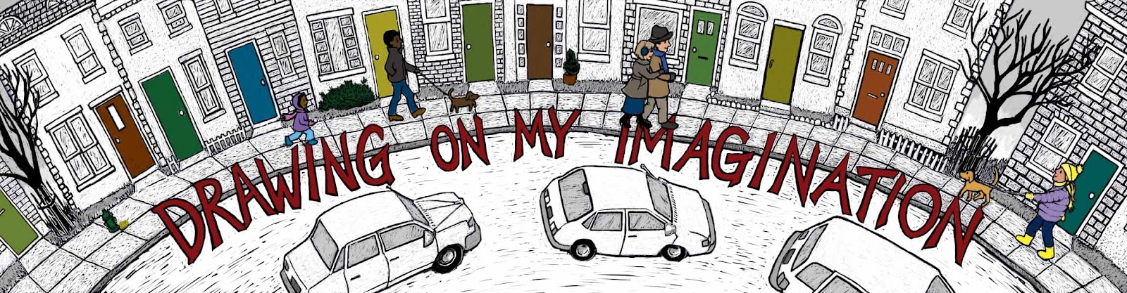
If you've visited this blog before, you may be thinking something's different this time.  You're not mad: I replaced the blog banner with one I created using my new Photoshop scratch board method.

I started with an image I used for the 2011 holiday season.  This I had drawn with pen and ink, and then added a watercolor wash to highlight the text, the people, and the doors (for a touch of rhythm).


I opened the scanned image in Photoshop, then inverted the colors and began to scratch away.


I kinda like the look mid-process, as the images are emerging from the blackness.  I may have to play around a bit more with that effect.


I liked the way the cars looked with the street still black, but because of the positioning of the text, the high contrast between street and sidewalk made it hard to read the words, no matter which color I filled the letters with.  I ended up scraping away most of the black of the street.  I guess its concrete instead of asphalt. 


I'm not sure I like this banner any better than last year's.  It's a bolder look, though, and I like that.

Tuesday, November 13, 2012

Tweaking . . .

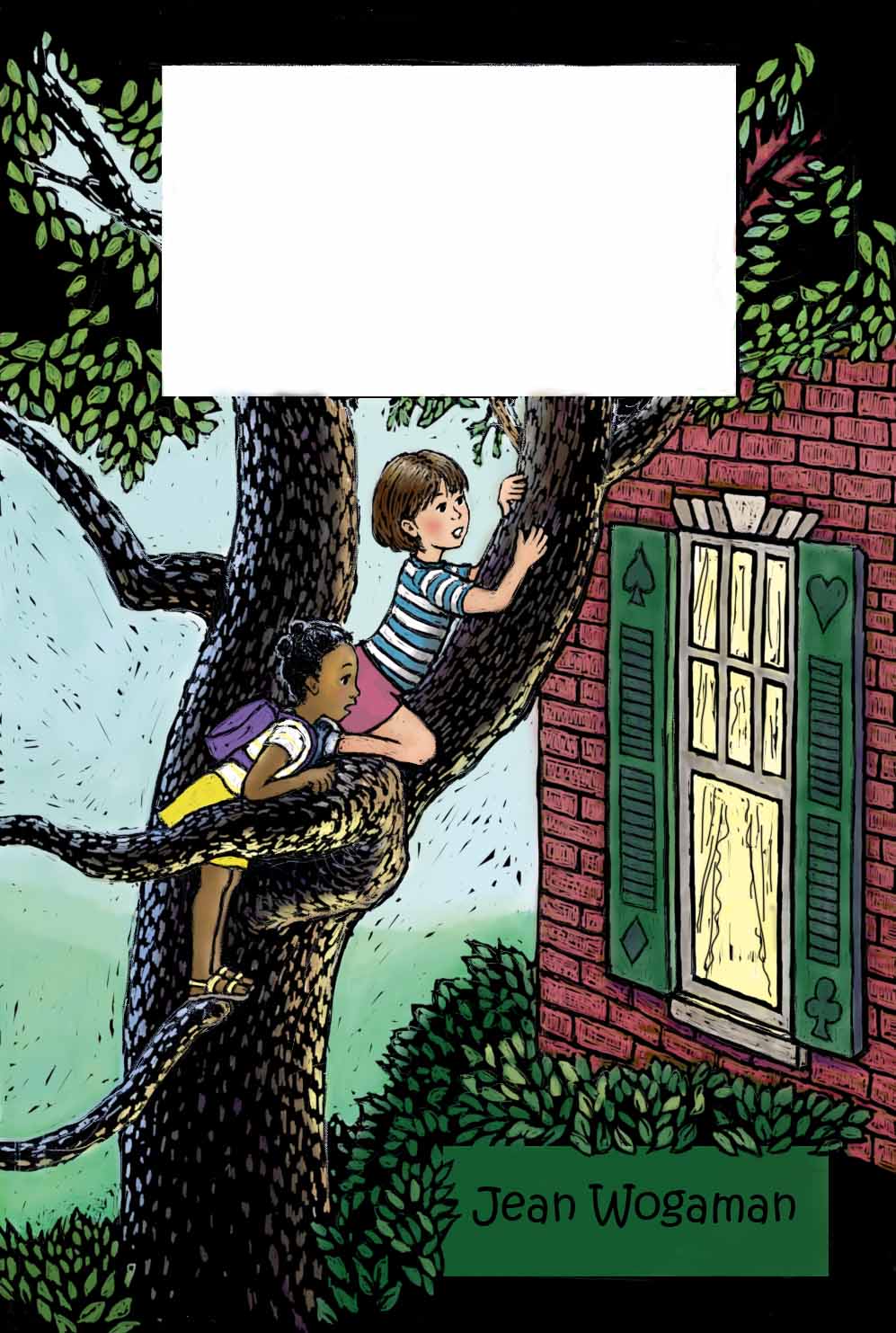
This afternoon I've been working on tweaking the image from my last post. Here it is again:


I want to use it as a sample book cover in my portfolio. I decided it isn't quite up to the standard I want to project.  It's a little too heavy on the dark green.

This is where I love working digitally.

I went back into my original Photoshop document, which I had saved unflattened.  In my "wash" layer, I erased the dark green off the shutters and repainted them with the putty colors of the window frames.  I easily captured the same colors with my color picker tool.  Then I lightened the rectangle in which my name appears by selecting it and filling the selection with a semitransparent light yellow green.  In the scratch board layer, I scraped away some of the weight of the black lines around the window panes with the eraser tool.

Here's how it looks now:


I think the lightening of the window area has created a bit of an illusion that the characters were lightened too.  I didn't touch them this round. Hmm. Interesting effect.  I am happier now.

On another, more exciting note, I have ordered myself a copy of Painter 12 software.  It's on sale half off.  A bargain not to be missed!  The only thing worrying me is that I don't have a super powerful computer.  It's about five years old, running Windows Vista.  When I'm using Photoshop, all other windows are closed.  I optimize the computer after every digital drawing session.  Last Friday I cleaned out old high res files I'll never need again.  Yet, I still run into sluggishness when I'm working with a lot of layers.  I want to be able to draw quickly, without having to wait a second for my line to appear on the screen.  I'm afraid adding another high grade art software will freeze up this old machine.  Maybe Santa will bring me a new PC with a 6+ GB hard drive and 1 TB of memory.  He brought me my Intuos 4 tablet last year.  Here's hoping!

What new art tools are you wishing for?

Saturday, November 10, 2012

Illustration Friday: Tree


This week's Illustration Friday image, "Tree," is a redo of a mock book cover.  As you can see, I am still attempting to perfect scratch board effects in Photoshop.  I feel like I'm making progress.  At any rate, I like how the tree looks.  If I work at a higher resolution next time, I'll be able to get more nuanced facial expressions.  I'm loving how I can work and rework the image without overworking it. Just scrape away mess ups with the eraser tool and try again!

I'm also loving the boldness of the medium.  It's a great improvement over the anemic original (overworked in watercolor and colored pencil):


Saturday, October 20, 2012

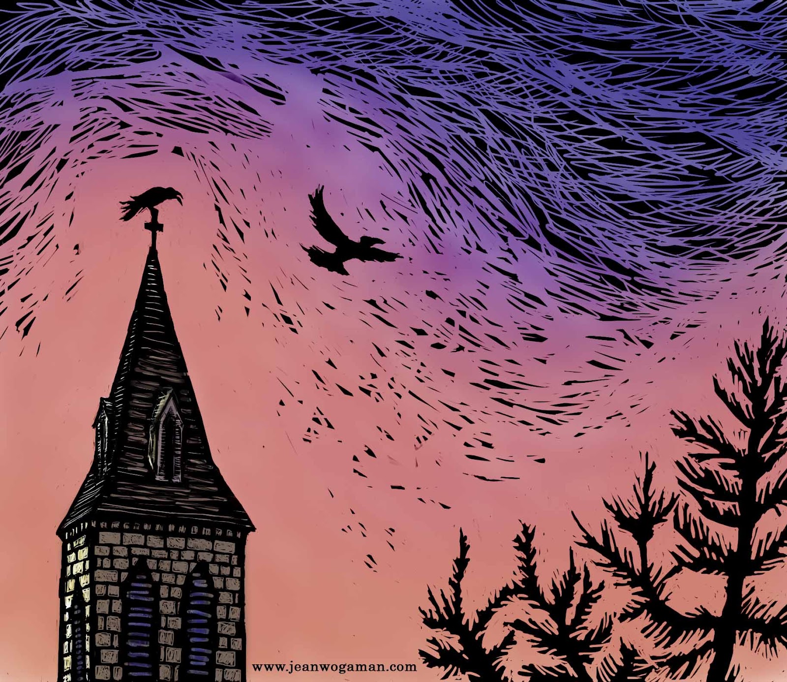
Illustration Friday: Sky


For the past week I've been plugging away at the sample grayscale interior illustrations for my middle grade novel.  I have three pieces I think I am happy enough with to include in my submission packet, so my next step is to create a sample cover for the book.  For that, I plan to color a Photoshop scratchboard pic.  I have completed a sketch, scanned it, and inverted the black and white in preparation for scratching out the image.

Then, having never tried colorizing one of these "scratchboards," I decided to do a test run with a simpler image, one I could rush through to work through all the kinks in the process without too much worry about the final product.  For subject matter, I addressed this week's Illustration Friday theme: Sky.  You see the results above.

I scratched away the black on the background layer, then did a "wash," applying fairly transparent color with a mixer brush tool.  (I chose the predominant sky color of vivid orange so that it with the black and the crows would evoke thoughts of Halloween.)  The "wash" dulled the black, so I had to spend a good chunk of the evening figuring out how to generate a black mask layer from the background and lay it over the top of the wash.  I ended up using the "subtract" layer style.  I'm sure there are other methods of achieving the same result, perhaps even simpler ones, but this was the first that worked for me, and I've been at this long enough for today.  I hope it doesn't take me too long to figure out from my notes how to do it again for the next piece.

Saturday, October 6, 2012

Drawing by Subtraction

I took a third Photoshop stab at my middle grade novel illustration.  This time working with a scratchboard effect (click on image to enlarge):


No actual boards were scratched in the creation of this picture.  I took my original pencil sketch scan

and inverted the colors in Photoshop.  Sorry, I have no picture of the inversion, but the effect was to turn the background black and the pencil lines into faint white guidelines.  I then "scratched" away with the eraser tool, varying the size and type of brush (you can use the same brush specs for erasing as you do for painting) to get different textures and levels of detail.

I think I have hit upon the right method for this particular book, which has a lot of physically dark scenes.  It's a very forgiving method.  Easy to "re-ink" an error and "scratch" again.  Better than real scratchboard that way.  Also better in that I don't have ink crumbs everywhere and a hand cramping around a knife tool.  It is significantly better than real scratchboard in the amount of control I can get over finer details like facial features.  That and the fact that it is FUN are the most important reasons to carry on with this method.

Next, I will work up light pencil sketches for two more chapter illustrations, then give them the Photoshop scratchboard treatment.  As I get better at this method, I may decide to rework this illustration too.  And I need to be thinking about a sample cover illo to submit with my query packet.  Perhaps a "scratchart" illustration in color.

Friday, October 5, 2012

Decisions, decisions . . .

When I last posted, I had just figured out the composition for an illustration to accompany chapter one of my middle grade novel-in-progress.  My next step was to play with the image in Photoshop, a software with which I still feel pretty unfamiliar--especially when it comes to using brushes and layers, and see if I could come up with an appealing (and efficient) style.

Okay, so here's the sketch that I used for the background layer in Photoshop (click on images to see them in their full glory):


I first tried a fairly inky style.  I have an Intuos 4 tablet and was please with the similarity of sensation as the black seemed to flow onto the image with my hand strokes.  Nice to be able to erase mistakes so easily.  That said, I spent a lot of time cross-hatching and erasing.  After a few hours, I was getting a little impatient with the process.  Sure, it's more forgiving.  But inking in Photoshop is taking me as much time as it does with pen and paper.  I decided to speed things up with a shading shortcut:

Not sure how I feel about it.  Clearly, I have adjustments to make.  For one thing, the image loses a lot when scaled down.  For another, the flatness of the shading is too much at odds with the line detail.  If I go this route, I will simplify the line work more than enhance the shadows to make the two elements coordinate better with each other.  Simpler will likely reduce better and, more importantly, I can't have each black and white novel interior illustration taking over a week to finish.  Not with the number I'm hoping to produce for this book.  But perhaps I'm just being too ambitious about that.  After all, I do have a day job, and other books to finish writing . . .

As I was fiddling around with my new tools, I came across the wonder that is the pressure sensitive brush.  I am in love.  This brush only works properly with the Intuos stylus, not with a mouse.  The line on the screen changes with the pressure I apply with the stylus.  I have spent the better part of today drawing a layer with a hard round 5 px brush that produces an effect similar to an H pencil, but without smudges all over the place (or the need for highly toxic fixative spray).  This drawing has the background layer with the original scanned drawing visible because I think the two images blended together makes for a more realistic pencil effect:


This makes for a softer image, and I'm not sure that fits with this particular story.  Must think on it.  Also, this tool is not saving me any time either.  *sigh*

Tuesday, September 25, 2012

Novel Illustrations

I think I may be finished with the latest round of revisions to my middle grade novel manuscript.  Before I start querying, I want to have a few sample illustrations--two or three black and white interior illustrations and a color cover piece--to accompany the package.  That's what I'm working on now.  The following sketch is from the opening scene:


My original thinking was to work up a final version in pen-and-ink with a tonal wash. To that end, I inked what was essentially the same base drawing (without shading) that you see above.  The result was such a disappointment that I'm not going to post it.  Part of the problem is that I drew it too small to get a real handle on the facial expressions.  Also, the characters, who are supposed to about twelve years old, looked too young.  Today I've been redrawing the same picture at a larger scale while aging up features slightly.


You will notice that I haven't done any inking or shading at this point.  As I was drawing this I started thinking of other possible ways of completing the image.  I have Adobe Creative Suite 5.5.  I have the day off from my day job tomorrow.  Maybe I'll see if I can work this into a strong image in the forgiving layers of Photoshop.

Hello!

 Just checking in to say I am still alive but less active here, obviously.  You can find my more recent art posts on social media, especiall...