Showing posts with label landscapes. Show all posts

Wednesday, December 23, 2020

Happy Holidays 2020


Here's the winter holiday card image for 2020. This is my first holiday card created entirely in Procreate on my new iPad Pro. 

I had some ideas that would have captured the craziness of this year, but decided against them in favor of something cozy and peaceful.  I send my card to about 50 people and I haven't kept up with all of them over the course of the year.  There's a good chance that a few of them are in a very bad place right now.  An image of a tree with Covid-shaped ornaments might not go over too well.

I hope you are reading this post from a safe and healthy place. If not, I hope the new year brings healing and hope. 

Wednesday, June 3, 2020

Pandemic pen-n-inking


I drew the image above first in pencil, then inked it with a Pigma Micron size 01 pen in an old hard-sided wirebound sketchbook with good quality, acid-free pages (maybe a Strathmore 400 series?). It's not for a particular project. Just for fun. We're all a bit more trapped indoors these days. So to keep from being driven too crazy by that, I'm doing drawings that play up how cozy and inviting home can be. 

Friday, December 21, 2018

Season's Greetings 2018


Another year, another holiday greeting card image... pen-and-ink with watercolor.

Saturday, November 29, 2014

This year's Christmas card

Here's what I've been working on today:


For my personal 2014 Christmas cards.  It took me a long time to come up with an idea for an image for this year's card.  I drew pages and pages of sketches of pffft before I settled on this.  Don't ask me how I came to think of doing a watercolor of Tudor style birdhouses, but once I landed on the idea, I knew it was the one.

Tuesday, December 24, 2013

Merry Christmas!


This year's Christmas card image, brought to you by a combination of pencil sketching, Corel Painter 12, and Photoshop.  Have wonderful holidays, everyone!

Tuesday, July 30, 2013

Illustration Friday: Jungle


For this week's quick pencil sketch on the Illustration Friday theme "Jungle," I thought, jungle means lots of trees. Then I thought, trees means treehouses.  And as anyone who has followed this blog for awhile knows, I love to draw treehouses.

Saturday, June 22, 2013

Illustration Friday: Surveillance


The above image is a Painter 12 pen-and-ink redo of an illustration I have done two versions of before.  I think it fits this week's Illustration Friday topic well.

The previous incarnations were to be sample cover designs for the portfolio, however, neither is up to that standard.  The scene is based on image I have in my head for an early middle grade work in progress.  (This particular scene, which would occur near the end, has yet to be written.)  As you can see, I was exploring (somewhat clumsily) with different media:


I did this first, rather heavy-handed, job using pen-and-ink, watercolor, and colored pencil on Arches hot press paper.  I (inexpertly) touched up the image in Photoshop, then did the (very amateurish) layout also in Photoshop.  

I have gotten bit better with Photoshop since then.  I think that shows a little better in my next stab at the cover:


Here I was going for a scratchboard effect.  I did a pencil sketch, scanned it in, then inverted the black and white. I used the eraser tool to scrape away the black, then added the color to a background layer.  I like the boldness of this style, but the characters need more expressiveness.  The layout is still limited by my inexperience with certain features in Photoshop.  I am hard at work on my InDesign skills, however, so that should be moot point soon.


Saturday, May 25, 2013

Illustration Friday: Tension


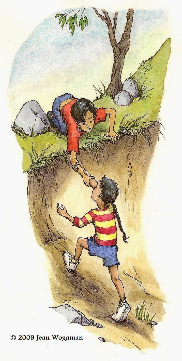
This week's Illustration Friday sketch is a remake of a remake of a remake of a remake of an early portfolio piece I called "Helping Hand."

Here's the first one (in watercolor on Arches hot press paper):


With a couple of portfolio critiques by children's book publishing professionals, I learned that the characters in my original picture were generic and their expressions bland enough to undermine my quest for employment as an illustrator.  A year or two later I took a stab at making them more dynamic.


One redo effort (with Copic Multiliner SP pens on Dick Blick 80 lb. drawing paper) had the girl about to crash headfirst into the creek bank. 

The next was closer to the original but, like the remake above, with the girl's head twisted back as if looking at someone or something she's trying to get away from in a hurry:


For this week's IF topic, I decided to take the last remake sketch and use it as a template for an ink layer in Painter 12, altering lines and details to increase the TENSION.  To save your scrolling muscles, here is the most recent drawing again:


Perhaps I'll attempt another full color version if I have time later.


How about you?  Do you ever go back to work you did months or years earlier and recraft it using new tools and your increased knowledge?

Wednesday, April 17, 2013

Illustration Friday: Wild


For this week's Illustration Friday, I toyed with a new working method in Corel Painter 12.

The black line you see is made with the crowquil brush tool, varying the size between 2 and about 5 pt.  I drew that first and made it the top layer in the file.  The color wash is made with a variety of gouache brushes.  This time I used only one wash color.  The different tonal gradations come from painting on separate layers and adjusting the opacity of each layer.  I like the simplicity of this method and the feel of the brushes involved. But as I add more layers, my old PC gets painfully slow.  Still, I think it's a process worth tinkering with for a while.  Maybe, one of these days, I'll get a new powerhouse machine.

The characters in this scene are loosely based on characters in a middle grade novel currently out on submission to agents.  I manufactured this scene purely for the IF challenge.  Nothing like it happens in the actual story, although I did find that knowing the characters ahead of time helped me to generate the scene more easily.

Monday, January 14, 2013

Illustration Friday: Ocean


This week's Illustration Friday offering and my first stab at using the real watercolor brushes in Painter.  I like the realistic look, but the strokes take so long to load that I can't see myself using the feature regularly.  Next, I'll be exploring other means of adding color to my digital ink drawings.  I will definitely be making more use of Painter's crowquil pen brush.  It's heavenly!


Wednesday, December 26, 2012

Illustration Friday: Glow

Futzing around with Corel Painter 12 for the first time.  This glowing lamp post in the woods (a la Narnia) I did with the soft pencil tool that was set for use when I opened the software:


I know I can do a lot more with the software, but today I am merely getting acquainted with the interface.  I love the realistic feel.  Very gratifying for an artist who had always assumed she would only be happy working with traditional media.  I look forward to playing around with the different surface textures and patterns.

Today I inadvertantly learned an important difference between Photoshop and Painter: When you're saving a Painter file in a different format, in my case a riff to a jpeg, you have to generate a different base name for the file or the save won't take.  In Photoshop, it's enough that your file name has a different extension.  You can have a sketch.psd and a sketch.jpg generated on the same PC by the same copy of Photoshop.  Painter says, "Get you sh*t organized or I ain't playin'!"

Wednesday, November 21, 2012

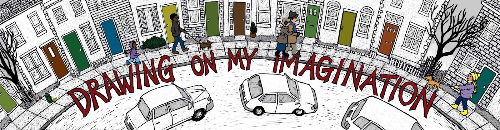
The New Blog Banner

If you've visited this blog before, you may be thinking something's different this time.  You're not mad: I replaced the blog banner with one I created using my new Photoshop scratch board method.

I started with an image I used for the 2011 holiday season.  This I had drawn with pen and ink, and then added a watercolor wash to highlight the text, the people, and the doors (for a touch of rhythm).


I opened the scanned image in Photoshop, then inverted the colors and began to scratch away.


I kinda like the look mid-process, as the images are emerging from the blackness.  I may have to play around a bit more with that effect.


I liked the way the cars looked with the street still black, but because of the positioning of the text, the high contrast between street and sidewalk made it hard to read the words, no matter which color I filled the letters with.  I ended up scraping away most of the black of the street.  I guess its concrete instead of asphalt. 


I'm not sure I like this banner any better than last year's.  It's a bolder look, though, and I like that.

Tuesday, November 13, 2012

Tweaking . . .

This afternoon I've been working on tweaking the image from my last post. Here it is again:


I want to use it as a sample book cover in my portfolio. I decided it isn't quite up to the standard I want to project.  It's a little too heavy on the dark green.

This is where I love working digitally.

I went back into my original Photoshop document, which I had saved unflattened.  In my "wash" layer, I erased the dark green off the shutters and repainted them with the putty colors of the window frames.  I easily captured the same colors with my color picker tool.  Then I lightened the rectangle in which my name appears by selecting it and filling the selection with a semitransparent light yellow green.  In the scratch board layer, I scraped away some of the weight of the black lines around the window panes with the eraser tool.

Here's how it looks now:


I think the lightening of the window area has created a bit of an illusion that the characters were lightened too.  I didn't touch them this round. Hmm. Interesting effect.  I am happier now.

On another, more exciting note, I have ordered myself a copy of Painter 12 software.  It's on sale half off.  A bargain not to be missed!  The only thing worrying me is that I don't have a super powerful computer.  It's about five years old, running Windows Vista.  When I'm using Photoshop, all other windows are closed.  I optimize the computer after every digital drawing session.  Last Friday I cleaned out old high res files I'll never need again.  Yet, I still run into sluggishness when I'm working with a lot of layers.  I want to be able to draw quickly, without having to wait a second for my line to appear on the screen.  I'm afraid adding another high grade art software will freeze up this old machine.  Maybe Santa will bring me a new PC with a 6+ GB hard drive and 1 TB of memory.  He brought me my Intuos 4 tablet last year.  Here's hoping!

What new art tools are you wishing for?

Saturday, October 20, 2012

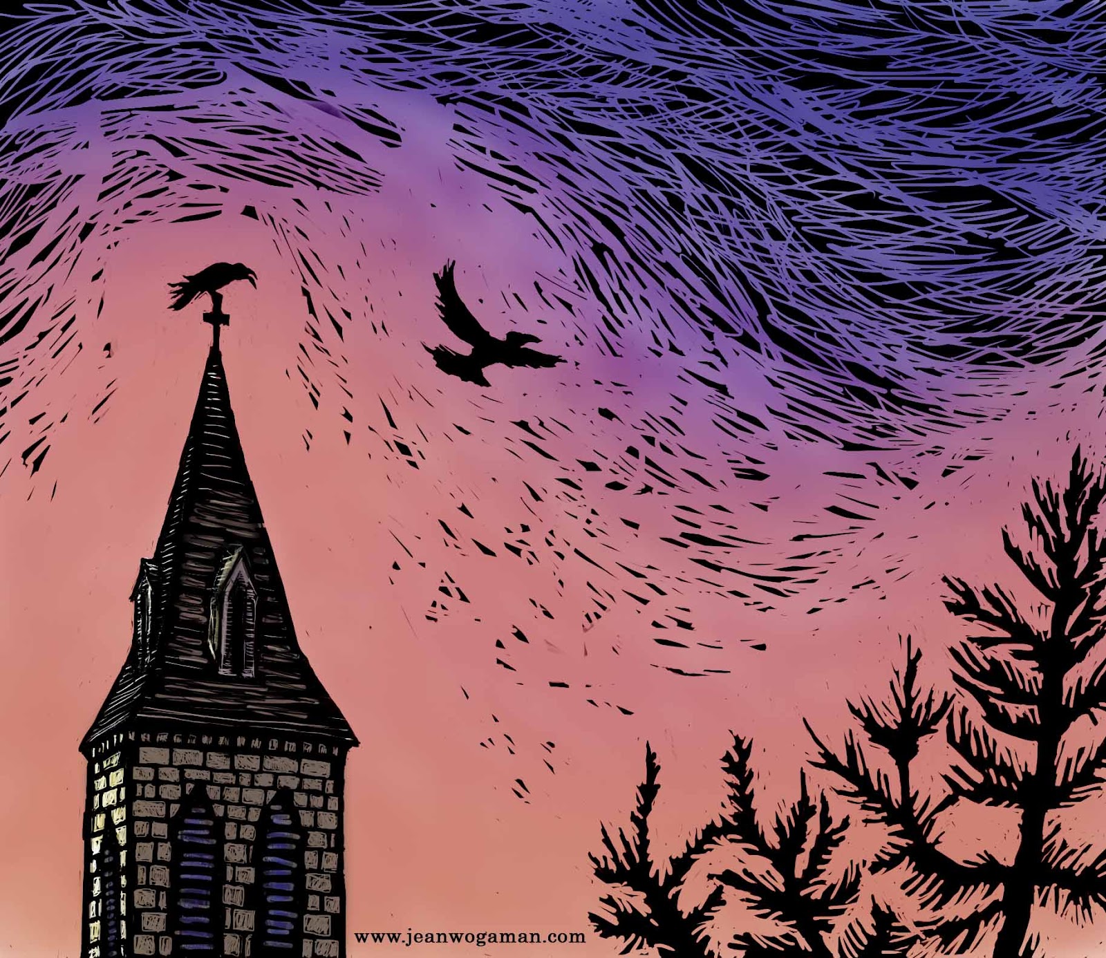
Illustration Friday: Sky


For the past week I've been plugging away at the sample grayscale interior illustrations for my middle grade novel.  I have three pieces I think I am happy enough with to include in my submission packet, so my next step is to create a sample cover for the book.  For that, I plan to color a Photoshop scratchboard pic.  I have completed a sketch, scanned it, and inverted the black and white in preparation for scratching out the image.

Then, having never tried colorizing one of these "scratchboards," I decided to do a test run with a simpler image, one I could rush through to work through all the kinks in the process without too much worry about the final product.  For subject matter, I addressed this week's Illustration Friday theme: Sky.  You see the results above.

I scratched away the black on the background layer, then did a "wash," applying fairly transparent color with a mixer brush tool.  (I chose the predominant sky color of vivid orange so that it with the black and the crows would evoke thoughts of Halloween.)  The "wash" dulled the black, so I had to spend a good chunk of the evening figuring out how to generate a black mask layer from the background and lay it over the top of the wash.  I ended up using the "subtract" layer style.  I'm sure there are other methods of achieving the same result, perhaps even simpler ones, but this was the first that worked for me, and I've been at this long enough for today.  I hope it doesn't take me too long to figure out from my notes how to do it again for the next piece.

Tuesday, January 24, 2012

Illustration Friday: Twirl

I'm busily working on a project I can't post about yet, so for this week's Illustration Friday I'm re-posting a sketch from my 2012 Sketchbook Project book:


To get home, you must first twirl the Ferris wheel until your house is at the bottom.

Tuesday, November 22, 2011

This Year's Christmas Card

Just finished my Christmas card picture:


If you scroll through my old posts or look at the color portfolio on my website, you can find the village I decided to blanket in snow for this image. I used Copic Multiliner SP pens and watercolor on Arches 140 lb. hot press paper.

Now to order the cards...

Friday, November 18, 2011

My Last Illustration Friday Sketchbook Project Combo for the Year

This is the last full spread in my Sketchbook Project "Treehouse" book:


The contrasting designs of the two houses is inspired by this week's Illustration Friday topic "vanity."  Sorry, no prizes for figuring out who's meant to be vain in this picture, but if you can come up with a creative reason why it would be the guy in the tree on the left, I'd love to read your explanation in the comments.

One page (half a spread) left to go before this puppy gets mailed to Brooklyn.

Hello!

 Just checking in to say I am still alive but less active here, obviously.  You can find my more recent art posts on social media, especiall...