Saturday, October 20, 2012

Illustration Friday: Sky


For the past week I've been plugging away at the sample grayscale interior illustrations for my middle grade novel.  I have three pieces I think I am happy enough with to include in my submission packet, so my next step is to create a sample cover for the book.  For that, I plan to color a Photoshop scratchboard pic.  I have completed a sketch, scanned it, and inverted the black and white in preparation for scratching out the image.

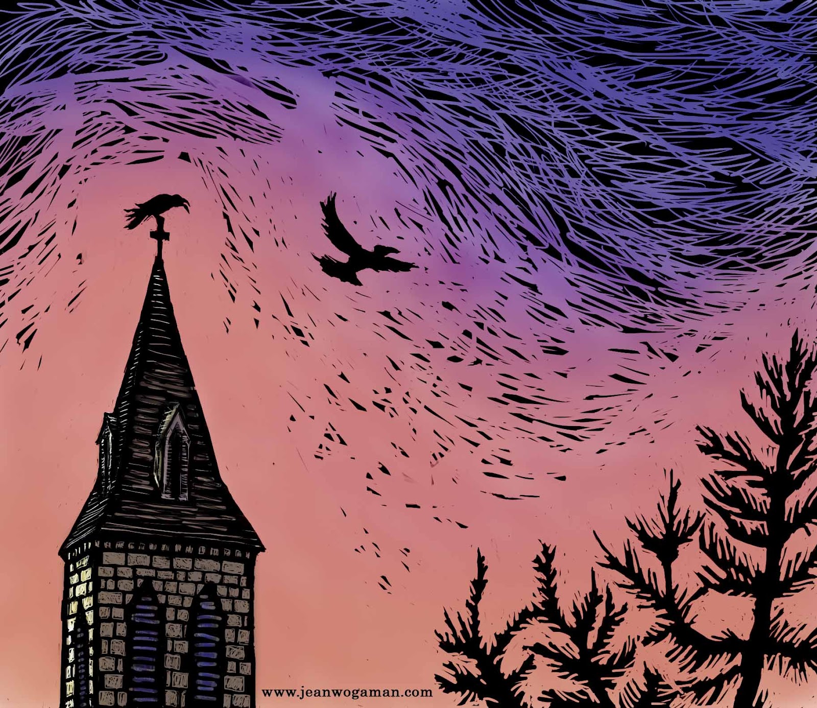
Then, having never tried colorizing one of these "scratchboards," I decided to do a test run with a simpler image, one I could rush through to work through all the kinks in the process without too much worry about the final product.  For subject matter, I addressed this week's Illustration Friday theme: Sky.  You see the results above.

I scratched away the black on the background layer, then did a "wash," applying fairly transparent color with a mixer brush tool.  (I chose the predominant sky color of vivid orange so that it with the black and the crows would evoke thoughts of Halloween.)  The "wash" dulled the black, so I had to spend a good chunk of the evening figuring out how to generate a black mask layer from the background and lay it over the top of the wash.  I ended up using the "subtract" layer style.  I'm sure there are other methods of achieving the same result, perhaps even simpler ones, but this was the first that worked for me, and I've been at this long enough for today.  I hope it doesn't take me too long to figure out from my notes how to do it again for the next piece.

Saturday, October 6, 2012

Drawing by Subtraction

I took a third Photoshop stab at my middle grade novel illustration.  This time working with a scratchboard effect (click on image to enlarge):


No actual boards were scratched in the creation of this picture.  I took my original pencil sketch scan

and inverted the colors in Photoshop.  Sorry, I have no picture of the inversion, but the effect was to turn the background black and the pencil lines into faint white guidelines.  I then "scratched" away with the eraser tool, varying the size and type of brush (you can use the same brush specs for erasing as you do for painting) to get different textures and levels of detail.

I think I have hit upon the right method for this particular book, which has a lot of physically dark scenes.  It's a very forgiving method.  Easy to "re-ink" an error and "scratch" again.  Better than real scratchboard that way.  Also better in that I don't have ink crumbs everywhere and a hand cramping around a knife tool.  It is significantly better than real scratchboard in the amount of control I can get over finer details like facial features.  That and the fact that it is FUN are the most important reasons to carry on with this method.

Next, I will work up light pencil sketches for two more chapter illustrations, then give them the Photoshop scratchboard treatment.  As I get better at this method, I may decide to rework this illustration too.  And I need to be thinking about a sample cover illo to submit with my query packet.  Perhaps a "scratchart" illustration in color.

Friday, October 5, 2012

Decisions, decisions . . .

When I last posted, I had just figured out the composition for an illustration to accompany chapter one of my middle grade novel-in-progress.  My next step was to play with the image in Photoshop, a software with which I still feel pretty unfamiliar--especially when it comes to using brushes and layers, and see if I could come up with an appealing (and efficient) style.

Okay, so here's the sketch that I used for the background layer in Photoshop (click on images to see them in their full glory):


I first tried a fairly inky style.  I have an Intuos 4 tablet and was please with the similarity of sensation as the black seemed to flow onto the image with my hand strokes.  Nice to be able to erase mistakes so easily.  That said, I spent a lot of time cross-hatching and erasing.  After a few hours, I was getting a little impatient with the process.  Sure, it's more forgiving.  But inking in Photoshop is taking me as much time as it does with pen and paper.  I decided to speed things up with a shading shortcut:

Not sure how I feel about it.  Clearly, I have adjustments to make.  For one thing, the image loses a lot when scaled down.  For another, the flatness of the shading is too much at odds with the line detail.  If I go this route, I will simplify the line work more than enhance the shadows to make the two elements coordinate better with each other.  Simpler will likely reduce better and, more importantly, I can't have each black and white novel interior illustration taking over a week to finish.  Not with the number I'm hoping to produce for this book.  But perhaps I'm just being too ambitious about that.  After all, I do have a day job, and other books to finish writing . . .

As I was fiddling around with my new tools, I came across the wonder that is the pressure sensitive brush.  I am in love.  This brush only works properly with the Intuos stylus, not with a mouse.  The line on the screen changes with the pressure I apply with the stylus.  I have spent the better part of today drawing a layer with a hard round 5 px brush that produces an effect similar to an H pencil, but without smudges all over the place (or the need for highly toxic fixative spray).  This drawing has the background layer with the original scanned drawing visible because I think the two images blended together makes for a more realistic pencil effect:


This makes for a softer image, and I'm not sure that fits with this particular story.  Must think on it.  Also, this tool is not saving me any time either.  *sigh*

Hello!

 Just checking in to say I am still alive but less active here, obviously.  You can find my more recent art posts on social media, especiall...